Use Cloudinary to automatically optimize images and dramatically improve the performance of your website
Summary
As the growing trend of websites being viewed on handheld devices continues, it’s imperative that the content being served is providing the best experience for the user regardless of their chosen device. Responsive sites can make content look sleek and provide better layouts for the user’s chosen device, but having unoptimized images slows the whole system down.
When it comes to delivering optimized images, there’s a sliding scale between resolution and image size. Obviously, we want the highest resolution possible with the lowest image size. In most current responsive frameworks this scale is balanced by creating an image tag with multiple sources, and leaving it up to the browser to pick the right source at runtime.
<img srcset="example-480w.jpg 480w, example-800w.jpg 800w"
     sizes="(max-width: 600px) 480px, 800px"
     src="example-800w.jpg">
The above bootstrap example will return a 480px or 800px version of the image depending on the viewport size. In order to make this happen, images must be manually sized to particular proportions available in advance. A task which often falls to content authors when it comes to adding images to their articles.
Providing the Best Experience
In order ensure that optimization is always respected during the site build process we’ve put together this set of best practices:
-
Compress all possible assets.
-
In general, runtime servers should be configured to return all content compressed with Brotli or GZIP. This provides savings across the board as less content is transferred and all modern browsers can support these algorithms.
-
Minify styles and scripts. Every style or script served should be minified if possible. This will significantly reduce the file size. Klish Group has built minification into publish workflows for past builds in order to automate the procedure.
-
Use the best image format, when possible. Most of the time this is PNG, but WebP is quickly becoming the new standard as it’s adopted by more browers (Image Format Comparison)
-
-
Start with high resolution images. There’s nothing more frustrating than having a pixelated image taking up the full viewport. We request that all images being used are at least 1600 x 500. A smaller height can be used if skinny banners are a part of the design, but keeping the width to 1600 ensures that even on the largest screens the image will not pixelate.
-
Target high value images in layout. Sometimes it’s not possible to provide responsive images with multiple breakpoints for every image on a site. In those cases we identify the greatest return for optimizations by gauging the size of the image in the layout (the bigger the image the bigger the optimization gains) and how often a page is expected to be viewed (target images on home page versus contact page). As such ,the lowest hanging fruit is generally large heroes, banners, carousels, profile pictures, etc.
-
Know your breakpoints. Setting your layout’s breakpoints early can help determine image dimensions and can help predict the level of additional work that will be needed to resize images. Breakpoints exist on a floating scale between optimization and image resize work, ideally we want to optimize to as many viewports as possible but there are diminishing returns producing images in many dimensions. We follow the default bootstrap breakpoints as a starting point for our designs:
Larger mobile phones (devices with resolutions ≥ 576px);
Tablets (≥768px);
Laptops (≥992px);
Desktops (≥1200px)
Working with Cloudinary, we’ve embraced an automated alternative to manually cutting images to match breakpoint sizes. Instead of providing a srcset of images at different sizes, authors include a single URL to their image and then Cloudinary takes over the job of determining the correct (custom-defined) viewport and providing an image with the correct dimensions in an optimized file format.
What’s Cloudinary?
Cloudinary is an end-to-end image- and video-management solution for websites and mobile apps, covering everything from image and video uploads, storage, manipulations, optimizations to delivery.
With Cloudinary, you can easily upload images and videos to the cloud and automate smart manipulations of those media which is then seamlessly delivered through a fast content delivery network (CDN).
Additionally, Cloudinary offers comprehensive APIs and administration capabilities, which you can easily integrate with your web and mobile apps.
Using the Power of Cloudinary Transforms
By utilizing Cloudinary’s on-the-fly transformations along with some conditional logic we’re able to produce a single URL that will automatically return an image that is:
-
Aware of both the size of the device viewport and the image’s own container
-
Optimized for the give pre-defined breakpoint
-
Automatically cropped to fit given dimensions (optional)
-
Using the best-available file format
Using custom transforms we’re able to inject “t_viewport_and_container_aware” into a Cloudinary image URL. When the image is loaded on a device, JavaScript injects the viewport and container sizes into the URL as well. Then the transform takes those variables and compares them to pre-determined breakpoints to determine what size image to return.
Here’s an example URL as it would be in the CMS:
https://res.cloudinary.com/example/image/upload/t_viewport_and_container_aware/Test/planet-earth-banner.jpg
At runtime the viewport width (vw) and container width (cw) are added:
Note: The container size is compared against the breakpoints first, as there is no reason to return a 1200px wide image on a page that is 1200px wide if the image’s parent container only takes up 25% of the page. Instead a 300px wide image is more optimized.
Note: The container width cannot be obtained in elements where the container is hidden on page load (carousels, tabbed content, etc). In which case the viewport width is used.
Resulting Image URL: https://res.cloudinary.com/example/image/upload/$vw_999/$cw_995/t_viewport_and_containers_aware/Test/planet-earth-banner.jpg
Using the case above, the container width is 995px and comparing that to the default best practice breakpoints requires that cloudinary returns an image with a width greater than 992px. In that case, cloudinary would return a 1000px wide image.
In addition to determining the width of the return image we can set specific aspect ratios and let Cloudinary auto-crop content to fit. To facilitate this, Klish Group has developed a set of default transforms for popular aspect ratios. The default transforms make use of Cloudinary’s auto-gravity algorithm with searches for faces or points of interest in the image to focus on. Instead of automatically determining the focal point we can also force Cloudinary to use the image center. For example:
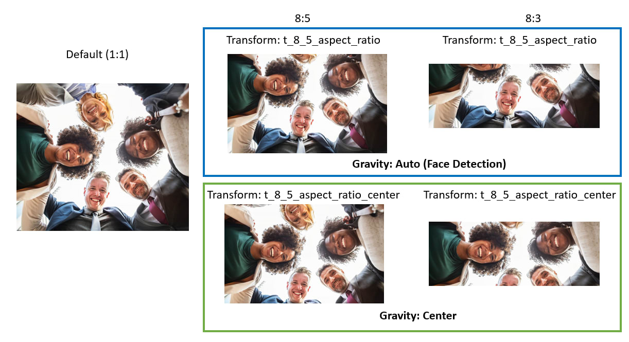
While these transforms are exist independently of the content aware transform mentioned above, the utility can be combined in order to provide specific aspect ratios, or any other image manipulation, based on breakpoints.
Default Image Transforms
Klish Group has created a handful of default transforms that can be used automatically by adding them to a Cloudinary URL. These can be used to ensure images are device aware and can also be honed in to automatically crop and return a particular aspect ratio.
| Transform | Function |
|---|---|
| Content Aware | — |
| t_viewport_and_container_aware | Picks breakpoint based on viewport or container size |
| Breakpoints | — |
| t_sm_viewport_img | Returns 800px image |
| t_md_viewport_img | Returns 1000px image |
| t_lg_viewport_img | Returns 1200px image |
| t_xl_viewport_img | Returns 1500px image |
| Aspect Ratios | — |
| t_1_1_aspect_ratio | Crops image to 1:1 |
| t_16_9_aspect_ratio | Crops image to 16:9 |
| t_4_3_aspect_ratio | Crops image to 4:3 |
| t_3_2_aspect_ratio | Crops image to 3:2 |
| t_8_5_aspect_ratio | Crops image to 8:5 |
| t_7_4_aspect_ratio | Crops image to 7:4 |
| t_8_3_aspect_ratio | Crops image to 8:3 |
Note : add “_center” at the end to set gravity to “center”, default is “auto”. Example: “t_8_3_aspect_ratio_center”